I am rebuilding portfolio sites for friends and people I am close to. I could have made one clean template and swapped the names, colors, and screenshots. It would have been faster. It also would have said nothing about any of them.
All of the sites live in one Next.js app because I do not need a separate deployment for every friend. That is where the shared system ends. The homepage looks like my site. Open a portfolio and it should feel like that person took over the browser.
Rifat: show the design getting designed
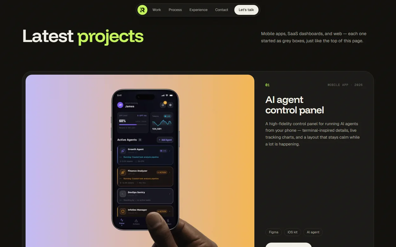
Rifat is a UI/UX designer. Opening his site on a polished hero felt backwards, so I made it start where his work starts: grey boxes, rough notes, and crossed-out image placeholders inside a design tool.

Scroll down and the page builds itself. The wireframe gets a grid, then color, real type, project imagery, and polish. A lime scan line marks the point where placeholders become the finished site. At the end, the design-tool interface gets out of the way.
I used GSAP for one scroll timeline running from sketch to live. The wireframe renders first on the server, so there is no flash of the completed page before JavaScript starts. Both versions use the same geometry. If the headline or image moved a few pixels between layers, the reveal looked like a transition between two screenshots instead of one design being finished.
Rifat’s own rules gave me most of the visual system: boxes before beauty, a strict grid, an 8px rhythm, and one loud lime. Lime only means that something is active or being built. I did not spread it over every button just because it looked good.
The rules I kept for Rifat were simple:
- The motion had to explain how he works. If it was only there to look expensive, I removed it.
- The wireframe and final page had to line up exactly.
- The design tool was allowed to frame the build, but not the work that came after it.
Evan: make “full stack” mean something
Evan builds products from the infrastructure up. Most full-stack portfolios turn that into a row of logos. I wanted to show the order of the work and how each layer depends on the one below it.
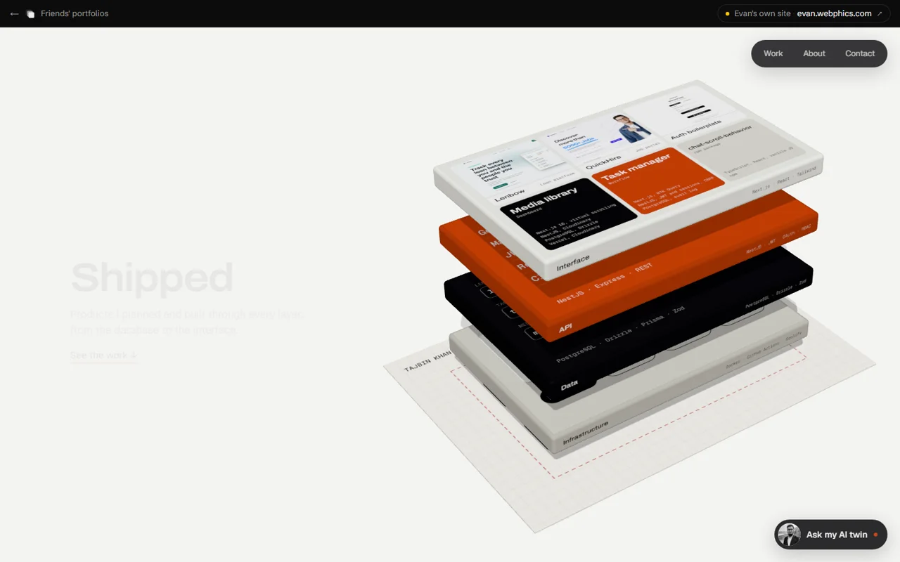
His site starts with a plan on paper. Infrastructure, data, API, and interface rise from it as four separate slabs. They close into one system, then the camera moves overhead and lands on the work.
My first attempt was a generated film. It looked impressive until I tried to read it. Labels changed between frames, the camera wandered, and scrubbing a large video felt bad. I rebuilt it in Three.js so every word, layer, and camera position stayed under my control.
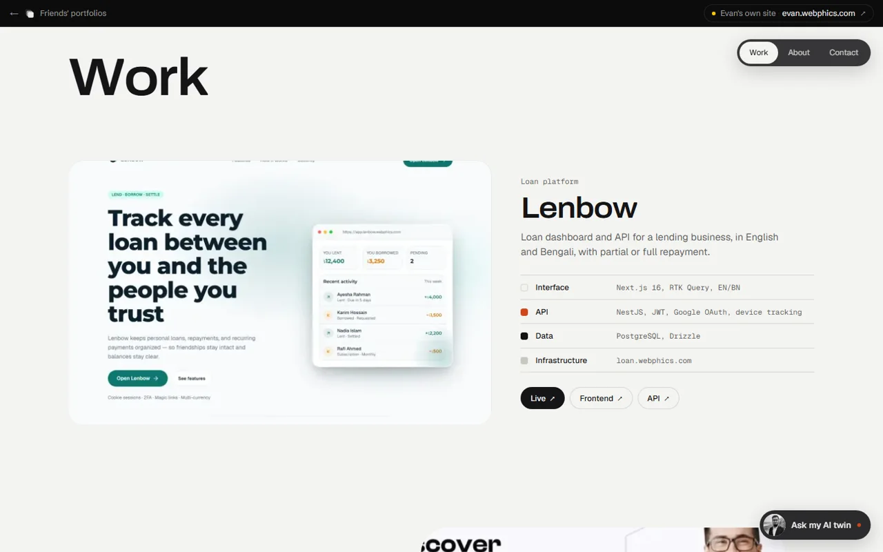
The labels on the slabs are real parts of his work, not texture. The same four layers come back under each project, which means the hero is still doing useful work after the animation ends. Paper, black ink, and vermilion came from Evan’s existing site. I rounded the slabs and cards because perfectly sharp architecture diagrams made the whole thing feel colder than he is.
The rules I kept for Evan:
- Start with the plan, not the polished screen.
- Put real work on the model. No fake terminal text and no decorative code.
- Reuse the four layers throughout the page so the opening is more than a trick.
- Prefer controllable 3D over a prettier video that cannot keep its labels straight.
Meghrai: leave the repair visible
Meghrai’s site took me the longest to figure out. I tried buildings, incident timelines, and monitoring dashboards. The buildings belonged to Evan’s idea, and a wall of graphs reduced platform engineering to watching things break.
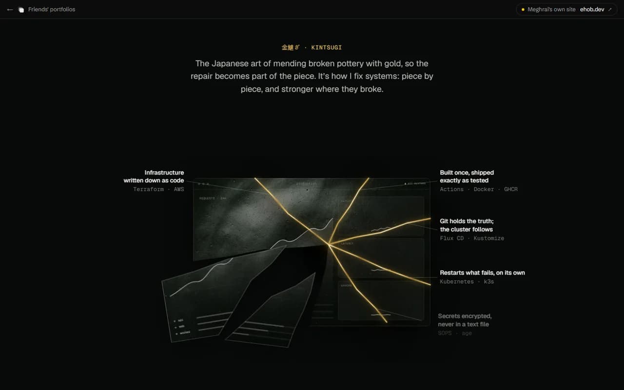
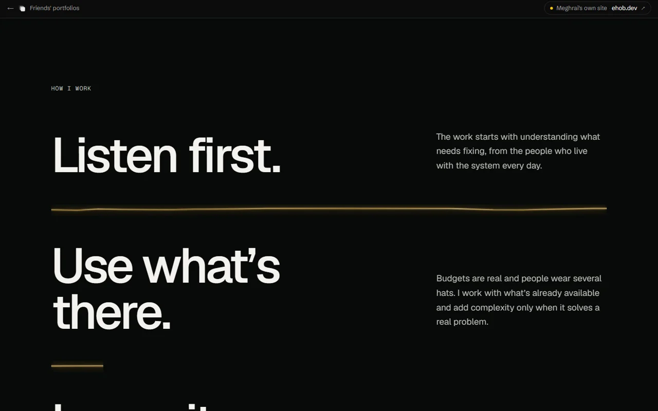
Kintsugi finally clicked. Meghrai often starts with a system that already exists. He finds the weak parts, repairs them, and leaves the system easier for the next person to run. Hiding the cracks would miss the point.
A black production dashboard breaks into eight shards. They return one at a time, and every gold seam names a real part of the repair: Terraform, repeatable builds, GitOps, self-healing workloads, encrypted secrets, observability, rollback, and handover.
Every shard uses the same crack geometry, so the seams meet when the pieces come back. That took more care than the glow. A beautiful gold line that misses its other half by three pixels ruins the entire idea.
Gold is only for repairs and joins. I kept the lime from Meghrai’s old site for actions such as copying his email. The seam continues through his beliefs, career path, and contact section. On smaller screens the labels become captions. With reduced motion, the page starts in its repaired state and lists the same information without making anyone sit through the animation.
The rules I kept for Meghrai:
- Every gold seam had to point to work he actually does.
- The broken state could not be treated as something embarrassing to hide.
- The page still had to make sense without animation.
- The metaphor had to survive below the hero instead of disappearing after one scroll.
The rule I am keeping
The code is allowed to repeat. The idea is not.
I do not want the next portfolio to look like any of these. I want to find the thing that person keeps doing, the detail that would be lost in a template, and build from there. That is also why the shared homepage stays small. It should still work when there are ten names on it, without pretending the newest unfinished site matters more than everything I built before it.
Built with Next.js, React, TypeScript, Tailwind CSS, GSAP, Three.js, Lenis.